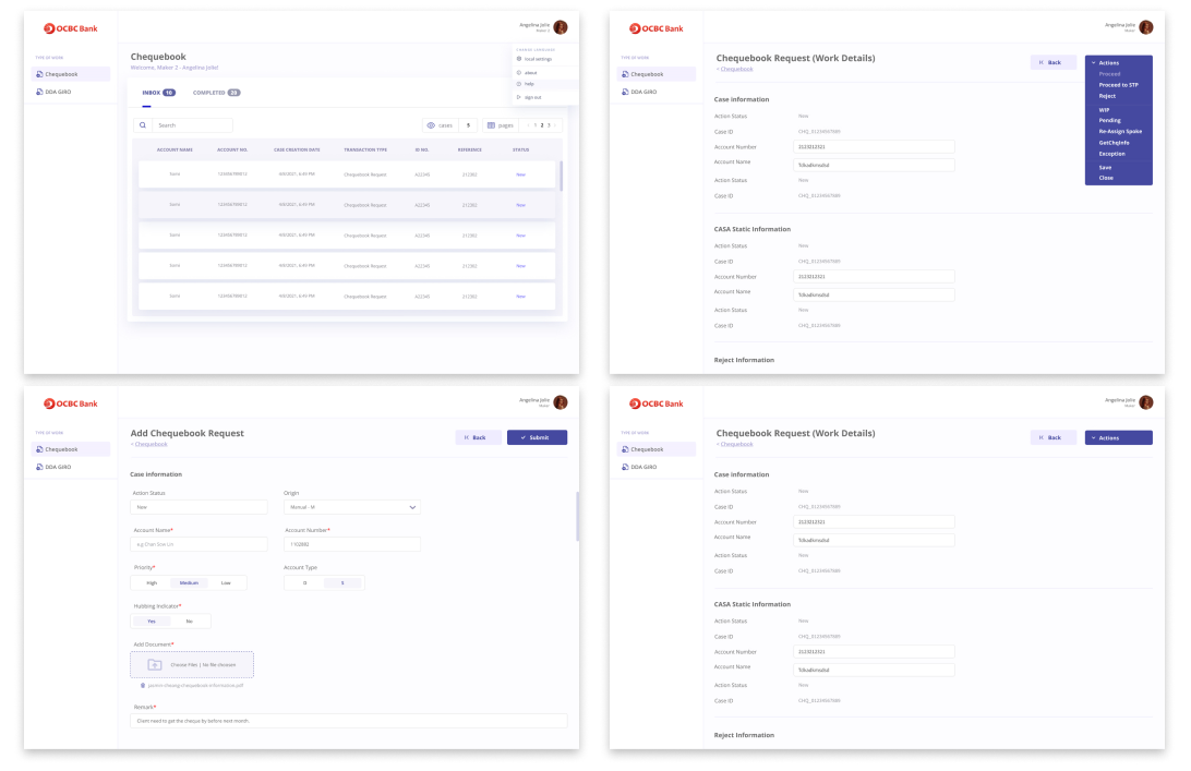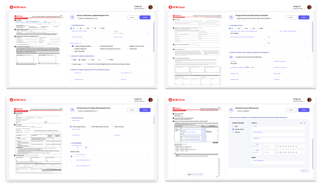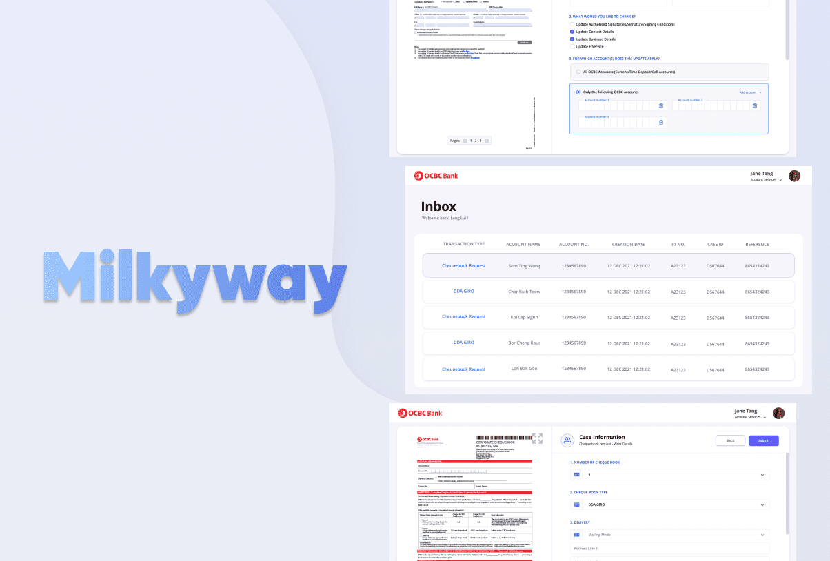
Milkyway is a system for banker to register customer account related form information into the bank system. The bank see the need to reworked digital experiences to improve digital adoption bank wide, as well as elevate overall user experiences.
My role as the Lead UI UX Designer for this project encompassed conceptualising and implementing a user-friendly design, conducting usability testing and incorporating user feedback to enhance the user experience.
Overview
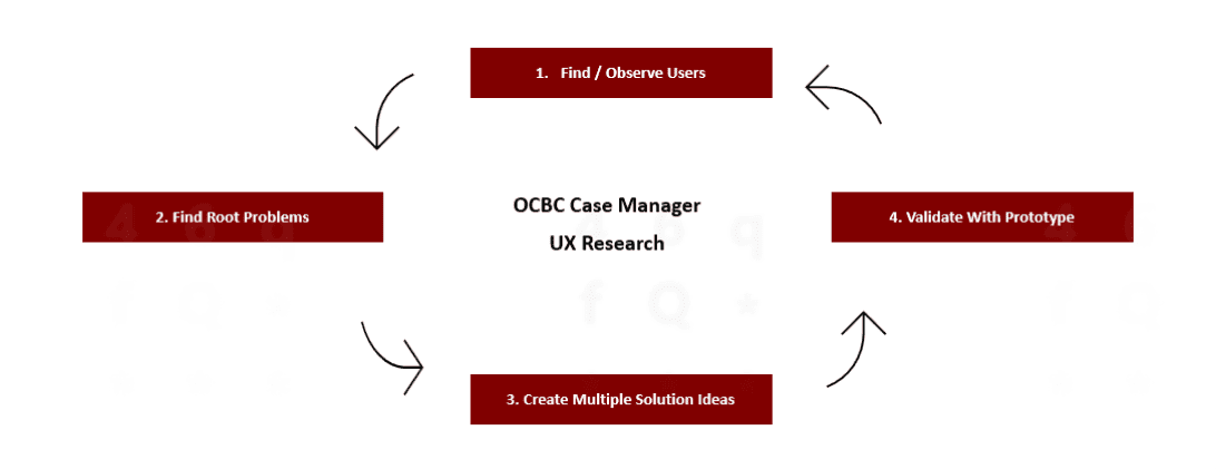
Problem
The system looks confusing especially to the first-time users. They do not know where they should start and where it ends.
Pain Points
1. Can new user or regular users always tell what is going on with OCBC Case Manager? (Example: show the process, progress, etc.)
2. Are messages in the system displayed in a language that user understand? – rather than developer speak? (For e.g Inbasket, Queue Depth)
3. Does the system help users feeling control and it is easy for user to back out if they make mistake?
4. Does the system work same with web app and the app in another platform? – Is it consistent and standard? (maker 1 only can see on desktop version and maker 2 can view both mobile and web)
Solution
It would be better if we show the functions in the system according to the role of each user. This can help users to be more focused and do their work more quickly and efficiently.
Suggestion for Improvement
1. Place a button/breadcrumb that allows users to return/back to the previous page.
2. Make the flow of the system clearer by letting them to know where they should start and where it will end.
3. Provide primary button, secondary button and tertiary button to allow users to differentiate each button function according to priority.
4. Give the user an idea of how a form should be filled out. (example: what format, any fields that requires a combination of letters and numbers and so on.)
5. Avoid too many jumps to a new page if it only requires a simple action.
Maker Overview
Goal
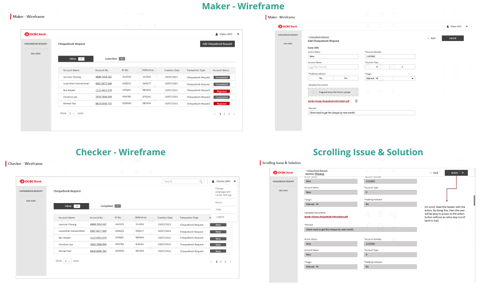
To allow users to add chequebook requests and DDA GIRO and see the status of the data that have been added.
Problem
• Users cannot see the chequebook request and DDA GIRO that has been added.
• Maker 1 and maker 2 are a bit confusing. Are they will see the same data and do the same action?
Solution
Add another page/section that allows maker to see each chequebook request and DDA GIRO that have been added along with their status.
Checker Overview
Goal
To allow the checker to respond to every checkbook request and DDA GIRO created by the makers.
Problem
• From the admin page, we do not understand which other parts the checker can access
• The use of pre – processing 1 and 2 is confusing. What is the difference between these two parts? – can we combine these two tables?
Solution
It would be better if we show the specific functions in the system according to the role. (Checker)
Checker Overview

User Story
Maker 1
- As a maker 1, I want to add a case by fill in the form based on document submitted by customer.
- As a maker 1, I want to view the form I submitted.
- As a maker 1, I want to check the status of the process.
- As a maker 1, I want to upload a document in a case.
- As a maker 1, I want system to prompt me error when I fill in wrong data format.
Maker 2 (checker)
- As a maker 2, I want to reject the case with remark.
- As a maker 2, I want to search a case.
- As a maker 2, I want to proceed the case.
- As a maker 2, I want to view the cases in mobile view (web mobile responsive or in app container).
Prototype
The new design interface for this portal now look clean and easier to navigate as we structured information into respective sections and layout. Some of the enhancement we did:
- Modernisation – With the new structured ui, they can find what they are looking for quickly.
- Home page display only 5 case – This can help users to be more focused and do their work more quickly and efficiently with only view and able to select from 5 case whenever they login to this portal
- Maker vs. Checker – We show the specific functions in the system according to the role.
