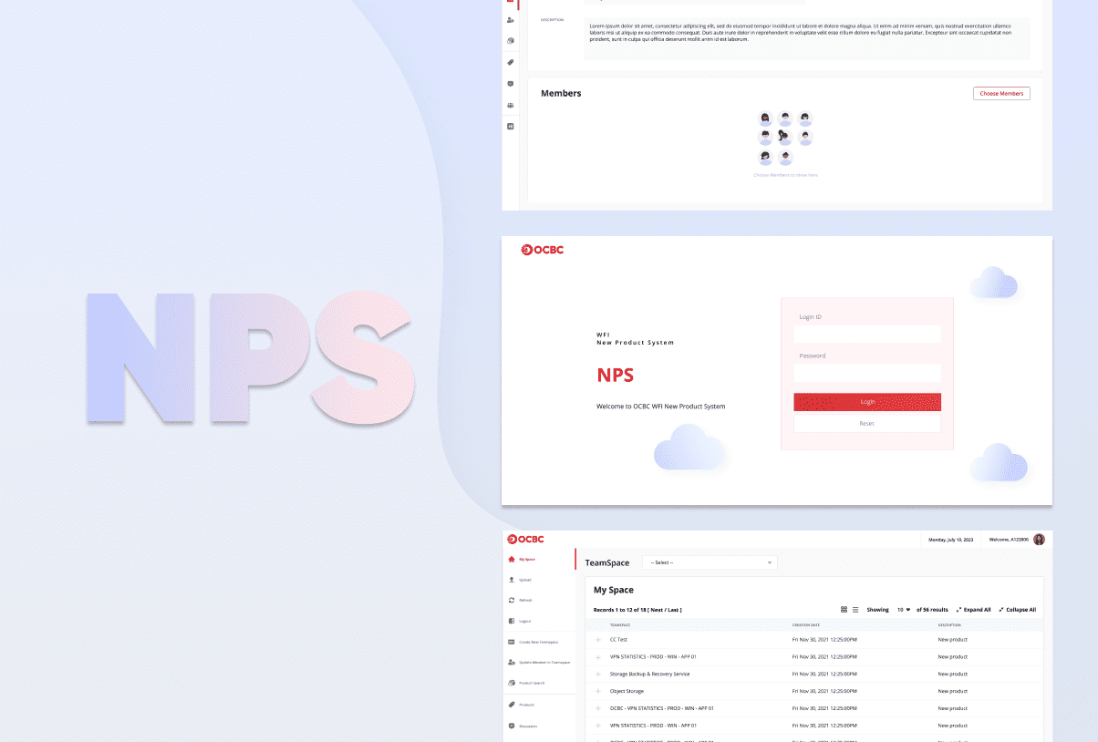
New Product System (NPS) is a system for banker to register a product, service, channel, or platform new to the bank or any company within the OCBC Group and being offered or distributed to external customers. The bank’s top management see the need to reworked digital experiences to improve digital adoption bank wide, as well as elevate overall user experiences.
My role as the Lead UI UX Designer for this project encompassed conceptualising and implementing a user-friendly design, conducting usability testing and incorporating user feedback to enhance the user experience.
Purpose to revamp NPS
- To improve the overall user interface design
- To improve user friendliness
- Reduce visual pressure
- Modernisation – make the design future proof for addon features and last for a longer period of time
- Organising sections and components
The Solution
Discovery
We started with discovery before going into design and optimisation. We conduct survey across users to understand their needs and wants and pain points they have using the system.
Pain Points
After collecting the survey we identify the pain points users have in common, their needs and wants and what is their expectations towards future design of the platform.
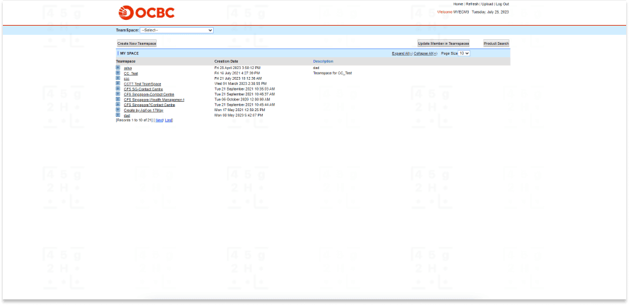
- Old system design
- Difficult for new user to understand how to navigate though the system
- Information were clutter at one area, while there are plenty of available space
- Section are not well organise especially when expand the section
Design Sprints
After identify the users needs and wants and pain points, we break them into smaller tasks. Tasks were then clock into design sprints. In each weekly sprints includes either wire frame, screen designs or prototypes.
Validating Design
After design the screen, we have an interactive ui prototype that we can demonstrate to the users how the new interface will look. We then review it with the users and bosses to validate the design, follow by iterate and refine necessary components before going to production stage.
Design Guideline
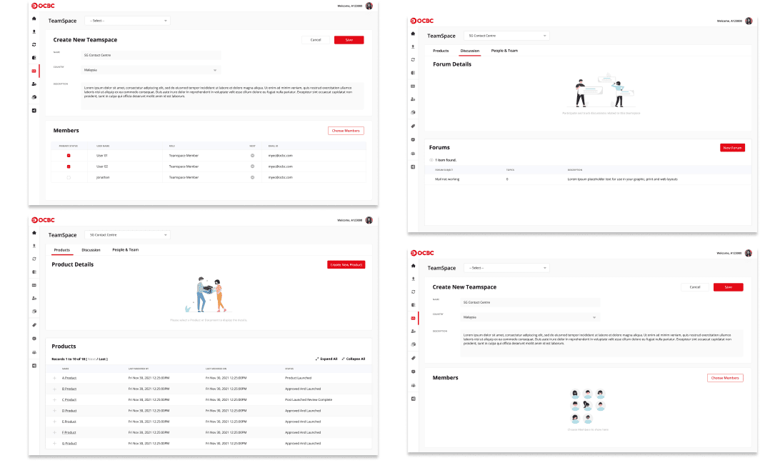
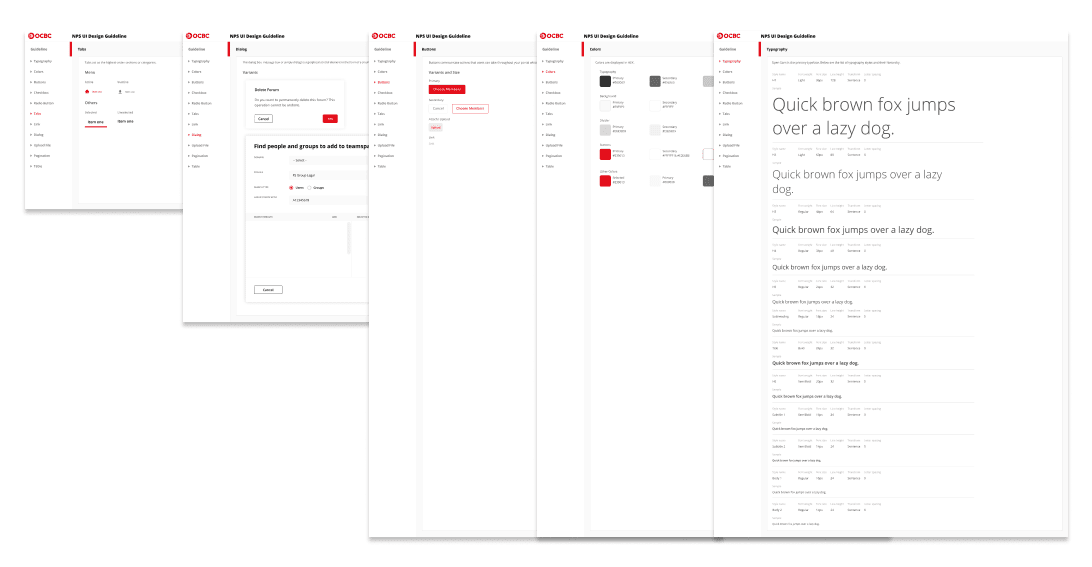
Creating a visual identity for is important because it helps to communicate the bank’s message and values. The design elements such as color, typography, tabs, dialog, table, popup all work together to create a visual language that can be easily recognise.
MVP Design
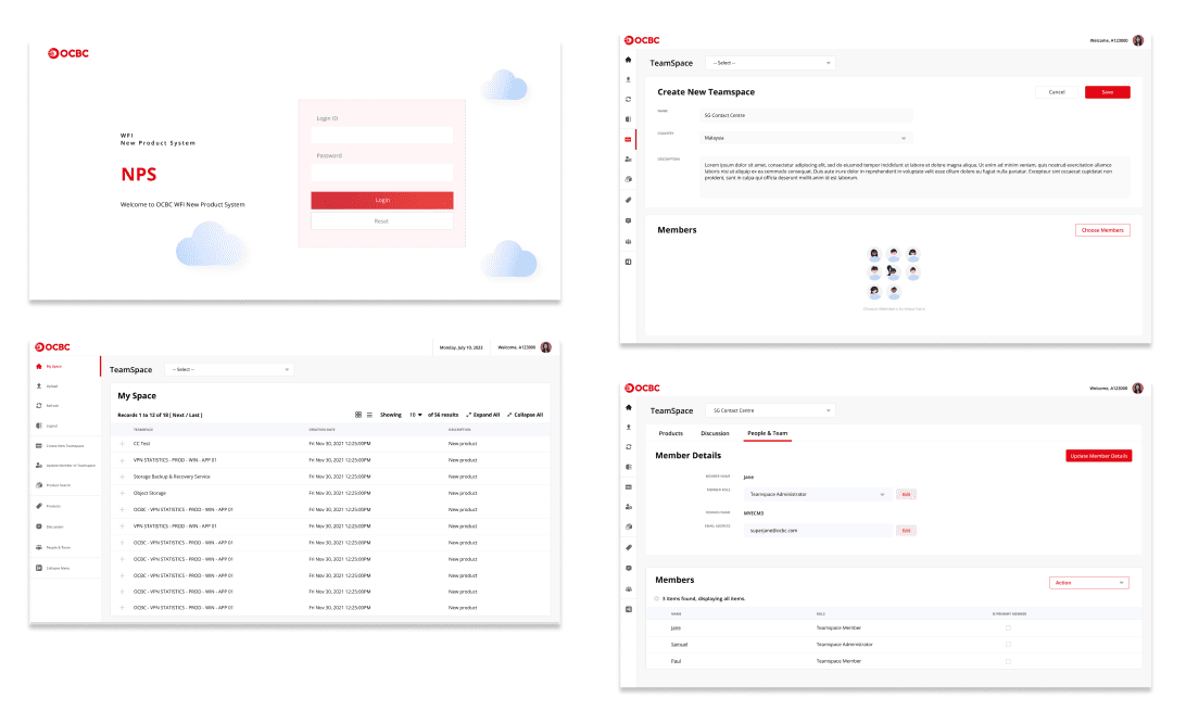
The prototype design were then tested and iterated in the Agile manner. Some of the features are as below:
Friction Reduction
The space is better utilised to provide a structure of teamspace and navigate through the page with organise filtering and grid or list display function.
Organise Display
View a revamped and restructure display design, user can conveniently expand folder, expand all to view all new product registered simply by selecting Expand All or Collapse All to automatically hide all sub folders. Knowing users core intention and deliver the simplest way to find information.
Modernisation
Revamp NPS portal visualisation with clean and minimalistic design and a clear restructure of new product listing which enhances user experience.
Conclusion
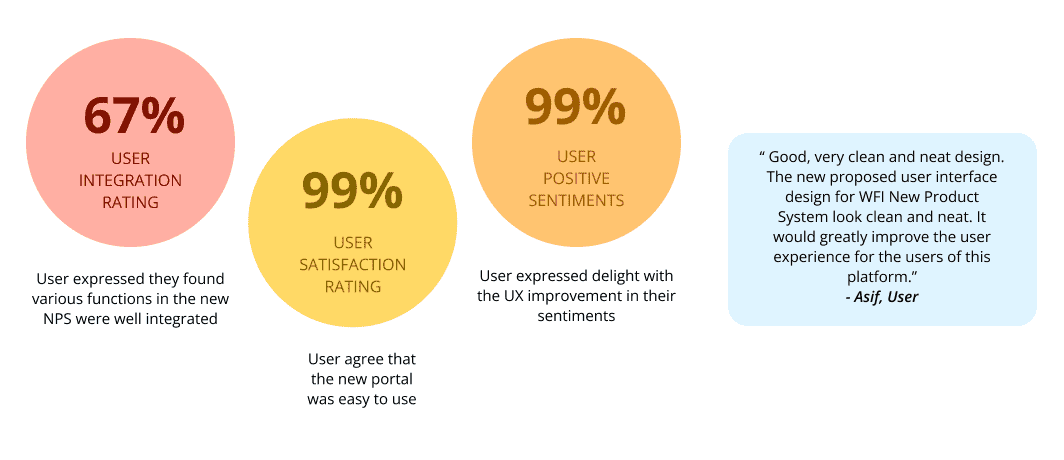
The release of new design was handled with intricate care to minimise friction and maximise adoption. Our main focus was modernisation and making a positive impact on the human experience. We took a user-centric approach and put the needs of our user at the forefront of our decision-making.
