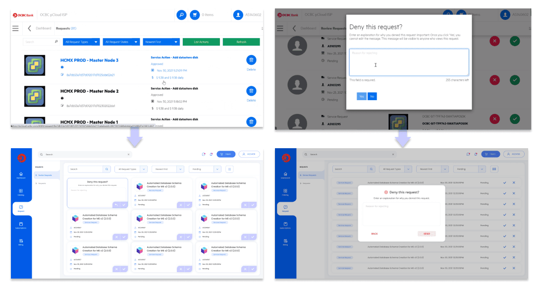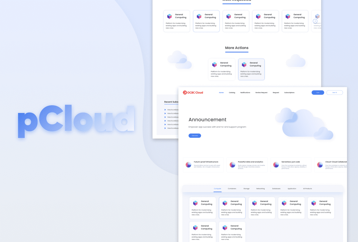
pCloud is a service portal the for OCBC Bank’s micro-service developers, software engineers and programmers across regions to subscribe and shop for all things cloud related to OCBC. The company saw a need to revamp the portal to make thousands developers, engineers and programmers across countries lives easier.
My role as the Lead UI UX Designer for this project encompassed conceptualising and implementing a user-friendly design, conducting usability testing and incorporating user feedback to enhance the user experience.
The challenge
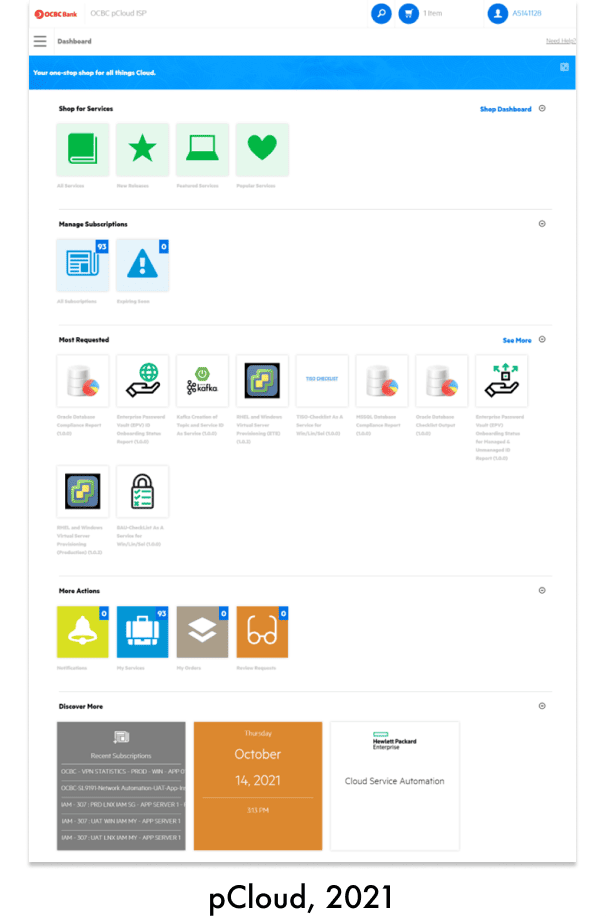
Although the product managed to provide the basic level of functional needs, the bank sees the need to revamp this portal to modernise the look of OCBC pCloud portal and elevate user experience beyond its functionality.
The problem
- Unfriendly navigation, causing major drop-off.
- Demanding processes, causing frustration to complete easy tasks.
- Poor product presence and brand representation.
- Overloaded product, creating confusion & feature cannibalism.

The solution
Discover
Stakeholder Interview
I ran interviews with my team and we obtained insights from all relevant stakeholders within the corporation, covering their objectives, success measurements, current perceptions, and experiences towards the brand and customers.
Customer Immersion
My team and I spent three days immersing ourselves in the life of a customer across different retail points physically to gauge their needs, struggles, and wants.
Heuristic Evaluation
We benchmarked the existing portal design against our heuristic evaluation tool and guiding principles to gauge performance and identify flaws.
Persona Development
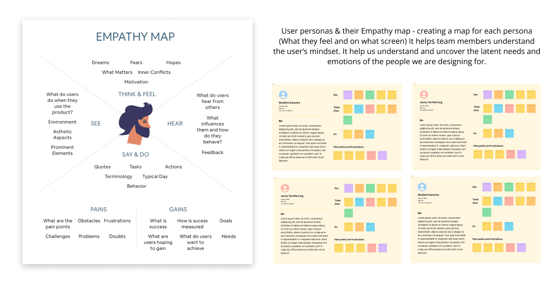
Following the previous exercises and their findings, we identified four users among the developer engineers and deep dived into their pains and gains.
Design & Optimise
Information Architecture
To reimagine what this product should be, we began by redesigning the portal architecture to serve as the backbone and frame of the new model. Additionally, we ensured that the new design was comprehensive.
Wire-framing & Concept Testing
With a shortlisted set of features to be included in the new solution, we began wire-framing as well as validating design concepts and prioritising features against actual user feedback.
Design Sprints
We divided and prioritised the pillars of the product into agile sprints that involved wire-framing, visual design, and usability testing. We then delivered the design to development by the end of each Agile sprint.
Usability Testing
We gather users feedback and iterate our design as necessary from time to time.
The Outcome
Identity & User-friendliness
- New product identity
- Decluttered view
- Simplified navigation
- Strong hierarchy of content
- Clear call-to-action
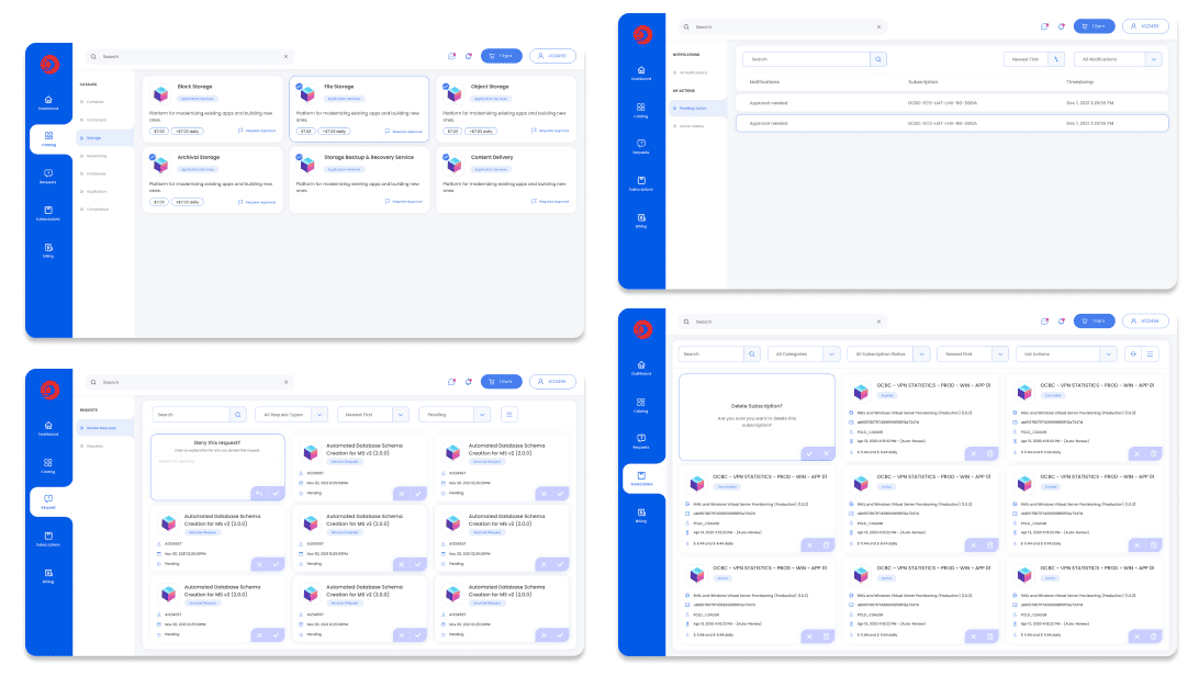
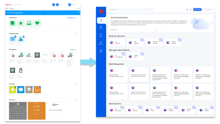
We created a new design guideline for pCloud portal to establish a consistent and unique identity. By removing irrelevant content and highlighting crucial information, the portal is now more user-friendly and easy to navigate. Components and information in portal is organise in chronological order for user to easily find them.
Simplification
- Simplified Interface
- Group Menu
- Reduced scrolling
We simplified the interface and introduced group menu. The new interface for this portal now look clean and easier to navigate as we grouped certain categories under main menu, and sub menus for every branch out categories. The new design better structure different cloud services the bank have. With the new structured ui, they can find what they are looking for quickly. Besides we also reduced the page long scrolling by introducing grid and list display options, which the grid options able to display 3 services in a row. This provides users with a more convenient experience, making their interactions with the product more effortless and efficient.
